AI Summary
As someone who has spent considerable time creating engaging email campaigns, I’ve noticed a significant shift in user preferences toward dark mode.
This change has prompted me to rethink my design strategies to ensure emails remain clear and engaging, regardless of the display setting.
Through trial and error, I’ve discovered several techniques that help maintain readability and brand consistency, specifically for emails in dark mode.
In this guide, I’ll share these insights to assist you in optimizing your emails for dark mode, enhancing the experience for all your subscribers.
Understanding Dark Mode in Emails
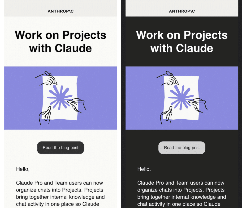
Dark mode is a display setting that swaps bright, light backgrounds for darker ones, reducing glare and making screens easier on the eyes, especially in low-light environments.
Many users prefer this mode as it also helps conserve battery life on devices with OLED screens. But it isn’t just about changing colors. Dark mode often modifies other elements.
For email marketers, this introduces an added layer of complexity as design elements need to adapt seamlessly to both light and dark settings.
Prevalence of Dark Mode Usage
Dark mode has become increasingly popular, with more users adopting it across apps and devices. An Android Authority survey from 2020 found that 81.9% of its readers utilize dark mode on their phones. Here are some reasons why dark mode seems to be gaining traction:
- Reduced eye strain: Dark mode makes emails easier to view in low-light conditions by replacing bright backgrounds with darker ones. This reduces glare and provides a more comfortable reading experience.
- Energy-efficient: Dark mode uses less power on devices with OLED or AMOLED screens, extending battery life significantly. This is especially useful for users who spend a lot of time reading emails on mobile devices.
- Improved readability: Dark mode minimizes glare and optimizes text contrast, helping users read emails more easily, even in dim lighting. It also ensures that important messages are always clear and legible.
- Modern appearance: Many users find the darker aesthetic visually appealing and really cool to be honest. It adds a professional, polished feel to email designs, helping businesses align with current trends.
- Accessibility-friendly: Dark mode can accommodate users with light sensitivity or visual impairments by offering a more user-friendly experience. It ensures your emails are inclusive and accessible to all recipients.
With more people choosing dark mode as their default, meeting this demand can improve email engagement. Offering well-designed campaigns in both modes builds trust with your audience.
Variations Across Email Clients
Not all email clients handle dark mode the same way. Some fully invert colors, others make partial adjustments, and a few ignore dark mode altogether.
Here’s a quick comparison to show how common email clients react to dark mode:
| Email Client | Dark Mode Behavior | Media Query Support | Background Adjustment | Special Notes |
| Apple Mail (macOS) | No change for most colors | ✓ Supported | ✓ Adjusted for pure white | Pure white (#ffffff) backgrounds may invert automatically. |
| iPhone / iPad (iOS) | Minimal changes, slight adjustments | ✓ Supported | ✓ Adjusted for pure white | Some white backgrounds invert depending on the <meta> tag. |
| Gmail App (iOS) | Partial inversion applied | ✘ Not supported | ✓ Limited support | Font colors may slightly adapt to darker backgrounds. |
| Gmail App (Android) | Partial inversion applied | ✘ Not supported | ✓ Limited support | Lighter backgrounds become darker automatically. |
| Outlook.com (Web) | Partial inversion for light colors | ✘ Not supported | ✘ No adjustment | Linked images may experience brightness tweaks. |
| Outlook 2021 (Windows) | Full inversion applied | ✘ Not supported | ✘ No adjustment | Dark mode may affect VML design elements. |
| Outlook App (iOS) | Partial inversion for backgrounds | ✘ Not supported | ✘ No adjustment | Text colors on dark backgrounds may also invert. |
| Outlook App (Android) | Partial inversion for backgrounds | ✘ Not supported | ✘ No adjustment | Linked images adapt to a slightly darker palette. |
| Office 365 (Windows) | Full inversion applied | ✘ Not supported | ✘ No adjustment | No specific targeting available for customization. |
| Office 365 (macOS) | Partial inversion for light colors | ✘ Partial support | ✓ Adjusted for pure white | Light backgrounds darkened slightly. |
| Windows Mail | Full inversion applied | ✘ Not supported | ✘ No adjustment | Uniform inversion affects all colors and elements. |
Dark Mode Targeting Methods
As explained earlier, email clients handle Dark Mode in various ways, often applying their own color adjustments to your email designs. But if you want to take control and ensure your emails look the way you intend in Dark Mode, you can apply custom styles.
@media (prefers-color-scheme: dark)
The @media (prefers-color-scheme: dark) query is one of the most reliable ways to target dark mode. This method allows you to define specific CSS rules for dark mode users. Many email clients and browsers that support dark mode use this query to detect user preferences.
For example, you can create alternative background colors, font colors, or borders specifically for dark mode. Here’s how it might look in practice:
@media (prefers-color-scheme: dark) {
  body {
    background-color: #121212;
    color: #ffffff;
  }
  a {
    color: #4d9efd;
  }
}
[data-ogsc]/[data-ogsb]
For email clients like Outlook, targeting dark mode involves using attribute selectors such as [data-ogsc] or [data-ogsb]. These selectors help modify styles for emails that the client partially or fully inverts.
- [data-ogsc]: Targets elements that Outlook’s dark mode partially adjusts, like light backgrounds or certain font colors.
- [data-ogsb]: Focuses on elements not affected by automatic inversion but still rendered in dark mode.
Here’s an example of how these selectors can be applied:
[data-ogsc] {
  background-color: #222222 !important;
  color: #e0e0e0 !important;
}

[data-ogsb] {
  background-color: #ffffff !important;
  color: #333333 !important;
}
Challenges in Designing Emails for Dark Mode
Designing emails for dark mode introduces a unique set of challenges that can affect how your message looks and performs. Below are some common obstacles and how they impact email design.
Color Inversion Issues
One of the biggest hurdles in designing for dark mode is how email clients automatically invert colors. For instance, a dark background might become light, and light-colored text could turn dark.
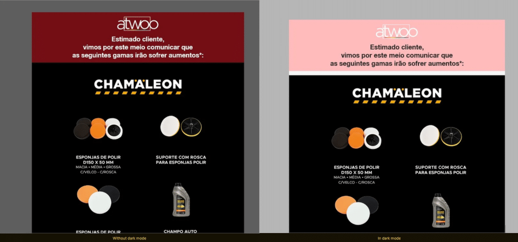
While this seems helpful, it can result in unintended contrasts that make text hard to read or clash with other design elements. This is especially tricky for emails that rely on specific color pairings for clarity and impact.
Image Rendering Problems
Images, particularly logos or graphics with transparent backgrounds, can behave unpredictably in dark mode. For example, a logo designed with dark text might blend into the background if it inverts or remains unchanged.
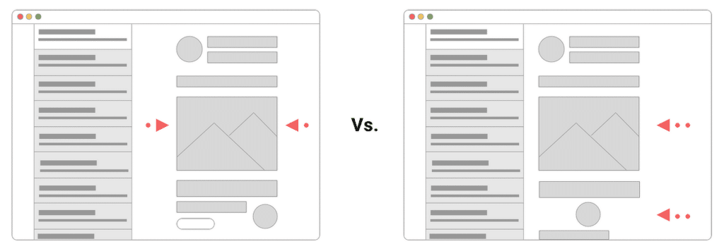
Similarly, gradients or shadows may appear distorted. This makes it essential to test images thoroughly and consider adding contrasting outlines or alternate versions optimized for dark mode.
Best Practices for Dark Mode Email Design
As dark mode gains popularity, ensuring your email designs look great in both light and dark modes is now a critical consideration. Let’s explore how you can optimize your email visuals to ensure they shine across all viewing settings.
1. Use Transparent Images with Appropriate Contrast
When designing emails for dark mode, your images can make or break the visual experience. One simple yet effective strategy is to use images with transparent backgrounds.
Transparent images allow your design to blend seamlessly into different color schemes. But transparency alone isn’t enough. You must also ensure that your images have enough contrast to stand out.
For example, light-colored logos or graphics might look great in standard mode but could disappear against dark backgrounds. Similarly, dark-colored images can get lost in lighter themes.
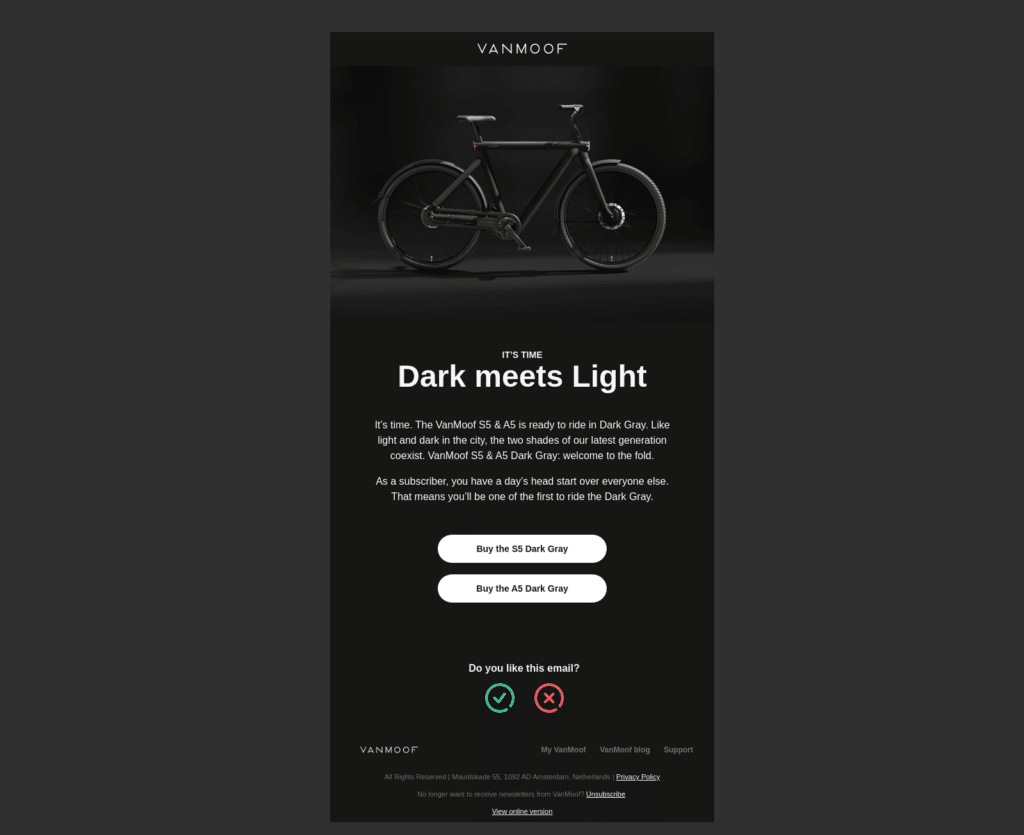
2. Avoid Hard-Coded Background Colors
When designing emails for dark mode, one common mistake is using fixed background colors that don’t adapt to the user’s preferences.
Hard-coded colors can create awkward contrasts or make text unreadable if they clash with the dark or light settings on a user’s device.
To prevent these issues, it’s better to use adaptable background colors. This approach allows your email to adjust seamlessly, ensuring that the design looks polished, whether viewed in dark or standard mode.
3. Provide Alternative Logos and Images
Dark mode often shifts colors and contrasts, which can make certain logos or images disappear into the background or look completely out of place.
If your logo relies on dark tones or transparent backgrounds, it may lose its visibility when viewed in dark mode. One way to solve this is by creating alternative versions of your logos and key images specifically optimized for dark mode.
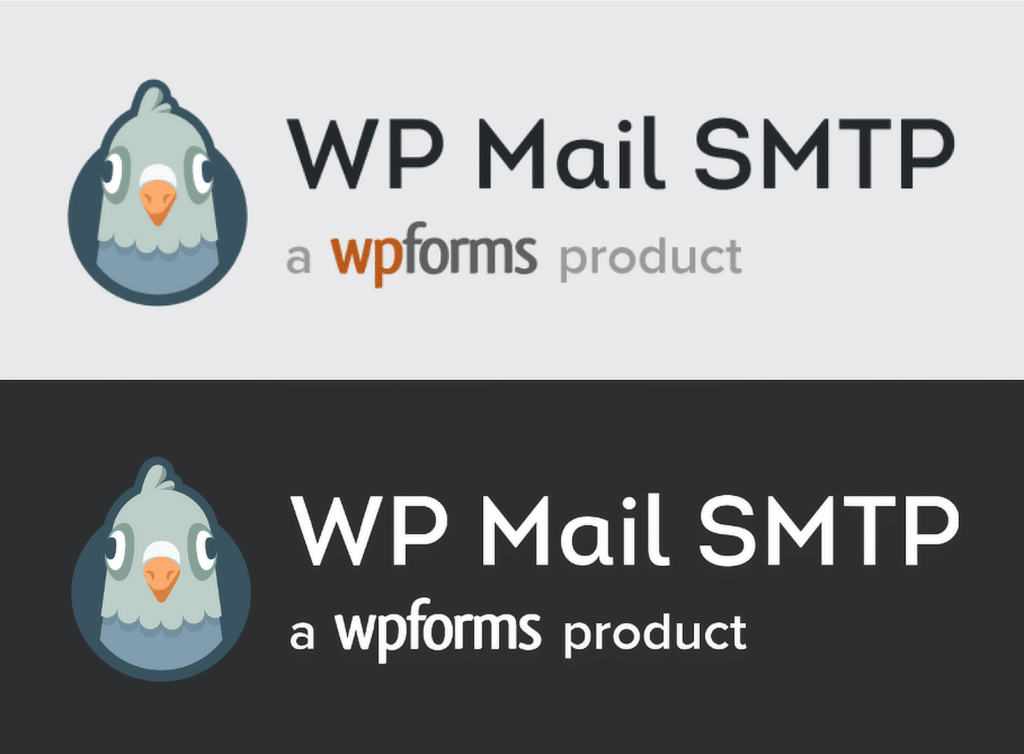
These variations can include lighter colors, added outlines, or subtle shadows to make them stand out. Taking this extra step helps reinforce your branding consistency in every scenario.
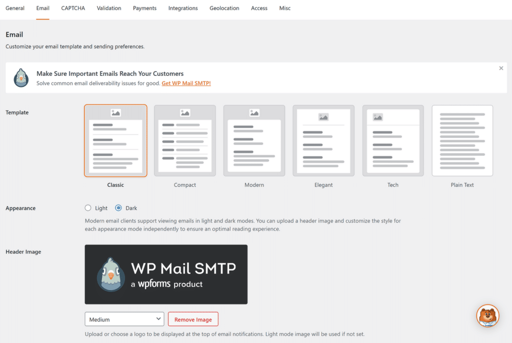
If you are using a form builder like WPForms and designing email notifications, you’ll be pleased to hear that the plugin offers you to upload both Light and Dark versions of your logos.
4. Choose Text Colors Carefully
Selecting the right text colors is essential for ensuring readability. While dark mode automatically switches black text to white, other text colors, such as headings or links, might not adjust as expected.
Always test your email to check how your text appears in both light and dark modes. Some colors that stand out in one mode may become hard to read in the other.
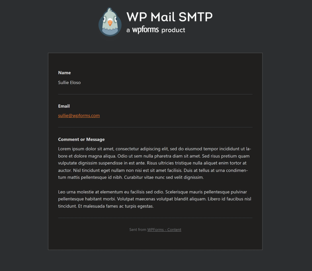
No matter what colors you choose, make sure your text has enough contrast against the background. This isn’t just about appearance, it’s about making sure your message is easy to read for everyone.
5. Test Emails Across Multiple Clients and Devices
Testing your emails in various email clients and devices is key to ensuring they look great and work as intended for all recipients. Dark mode can behave differently depending on the platform, so what works on one device might not translate perfectly to another.
There are several tools available to help you check how your emails appear in dark mode. These platforms allow you to preview your emails across a variety of email clients and devices:
- Litmus: Offers detailed previews for different email clients, including how emails appear in dark mode.
- Email on Acid: Provides testing options for dark mode and highlights potential design issues.
- GlockApps: Focuses on email deliverability but also includes rendering previews in light and dark modes.
- Mailtrap: Simulates email designs and shows how they appear across various devices and apps.
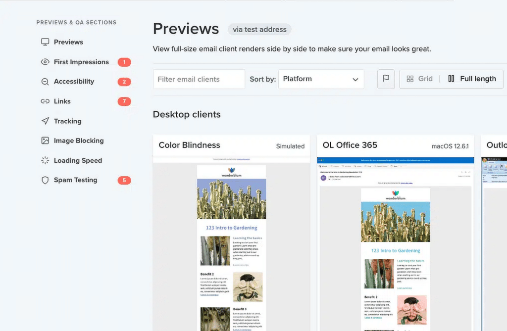
Once your emails are live, feedback from recipients can help refine your designs. Ask users if they experience any readability issues or visual inconsistencies in dark mode.
FAQs — Best Practices for Designing Emails for Dark Mode
Designing emails for dark mode is a popular topic of interest among our readers. Here are answers to some common queries about it:
How do I make my email dark mode?
Most email marketing services offer the ability to change your email design to dark mode. Just remember that to make your email compatible with dark mode, use neutral background colors and avoid hard-coded white or black elements.
How does dark mode affect emails?
Dark mode changes the background and text colors to darker tones, which can impact the readability of emails with light-colored designs or images.
Automatically inverted colors may not always look as intended, so testing and adjustments are necessary to maintain consistency.
How do I customize my email design?
Customizing an email design involves setting up proper color schemes, ensuring enough contrast between text and background, and using transparent images to adapt to different modes.
Test your design across various email clients to verify compatibility with dark and light modes.
How many people use dark mode for emails?
Studies show that a significant percentage of users prefer dark mode for emails, with adoption rates varying between 30% and 50%, depending on the platform.
This trend highlights the need for email designs that work well in both light and dark modes.
Next, Email Design Examples and Best Practices
If you send emails, you need to consider your design. Even the most compelling message can be overlooked if it isn’t presented well. This guide explores some key email design best practices, complete with examples, to help you create emails that not only look great but also drive action.
Ready to fix your emails? Get started today with the best WordPress SMTP plugin. If you don’t have the time to fix your emails, you can get full White Glove Setup assistance as an extra purchase, and there’s a 14-day money-back guarantee for all paid plans.
If this article helped you out, please follow us on Facebook and Twitter for more WordPress tips and tutorials.

