AI Summary
If you send email, then you need to consider your email design — simple as that. Because even the most compelling message can be overlooked if it isn’t presented well.
In this post, we’ll explore some key email design best practices, complete with examples, to help you create emails that not only look great but also drive action.
Email Design: Examples and Best Practices
In This Article
Stay on Brand
Consistency is key in email design. You want to create emails that reflect your brand’s visual identity, so include your brand colors, fonts, and logo in every email.
You should also use your emails as opportunities to link to your website and social media. This not only makes your emails instantly recognizable but also reinforces your brand’s presence.
Luckily, you have multiple platforms and tools at your fingertips to help you create on-brand email designs. Plus, many platforms offer email design templates for you to use and customize that already have branding options and other important elements included.
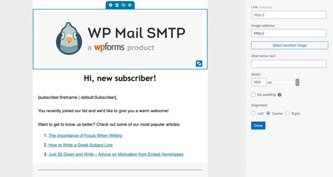
WPForms, for example, provides customizable email templates for notification emails. Your website visitors receive a notification email when they submit a form through your site, and these emails need consistent branding just like the rest of the emails you send out!
Have Fun with Emojis
Incorporating emojis in your subject lines or body content can add a playful touch and catch your audience’s eye. So don’t shy away from this fun addition to your email marketing strategy!
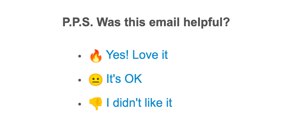
That said, you don’t want to turn your email messages into some kind of modern hieroglyphics.
Be sure to use emojis sparingly and only if they align with your brand’s voice, so you avoid coming off as unprofessional. When I’m writing newsletter emails, for instance, I like to include one emoji in my email’s subject line or preheader (which we’ll talk about next) and sprinkle just a handful of them throughout the email message.
It’s a creative way to take readers from 😒 to 😄.
Use an Attention-Getter
Your subject line is the first thing your readers will see, so make it count. Create a subject line that piques curiosity or offers value, and make sure it reflects the content of the email to set the right expectations.
But also, don’t leave your readers hanging! Use as few words as possible when writing the subject line — you want it all to fit on the line with nothing cut off.

So, your subject line should be short and sweet while making it clear to the recipient that this email is worth opening. Check out some of the subject lines in this abandoned cart email examples guide.
But don’t hurt yourself trying to make it all fit and be valuable and be catchy — let artificial intelligence help you! Take a look at our guide on using AI to generate email subject lines to learn more.
Push the Pre-Header
The pre-header text is like a second subject line. It’s another chance to really sell it to your recipient!
Use this space wisely to complement your subject line and entice your readers to open the email. It can provide a brief summary or an additional hook.

So basically, do everything I said to do with the subject line, again. Except don’t make the lines too similar… Somewhat tricky, I know.
Again, don’t forget that AI can be a huge help in this aspect of your email design. In fact, AI can help you with nearly every facet of your email marketing.
Take a look at my extensive list to see which tools I suggest for each email-related task. I’m sure you’ll find something there for you!
Make it Mobile Friendly
How are you reading this article right now? Is it on your mobile device? Do you ever check your email on your phone? I bet you have before!
The point is that, with over half of emails being opened on mobile devices, your design must be mobile-friendly. And even though your email-sending platform of choice may feature mobile-responsive features, there are a few elements of design that you can incorporate yourself to ensure a good mobile experience.
To guarantee your email design is mobile-friendly, you should:
- Format your email in a single-column layout
- Use large fonts where possible
- Include buttons that are easy to tap with a finger on a small screen
Then, be sure to preview the mobile version of your email design before sending it so you know what it looks like on a small screen.
Add a Personal Touch
A little bit of a personal touch can go a long way, and many of the mailer platforms I mentioned earlier can help you do it.

Personalizing your emails by including the recipient’s name or tailoring content based on past interactions can make your emails feel more relevant and engaging.
So, use the data you collect through your site (names provided on forms, geolocation details) to segment your audience and send more targeted emails.
Get Right To It
A wise teacher once taught my class about “trimming the fat” when writing, and that’s no different when it comes to writing emails. Often, you have to cut out the excessive and unnecessary content that your readers don’t want or need.
In other words, just get to the point!
Prove to your readers that you respect their time and attention, and you’re not going to waste it. This will benefit you in the long run, and has the potential to help you keep your subscribers and loyal customers.
Call the Action
A “call to action”, or CTA, is a direct prompt you’re giving your reader for an action you want them to complete.
Your CTA could be to read an article, sign up for your newsletter, follow you on social media, and so on.
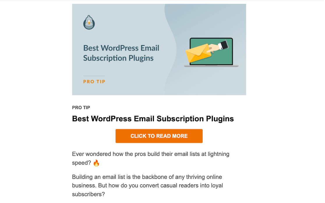
So, to be effective, your CTA should have these attributes:
- Is clear, compelling, and easy to find
- Is utilized as a button or bold text to stand out
- Requires action that is easy for the recipient to complete
You can see one of the CTA buttons I made for this article just below this sentence. Isn’t it cool?
Go with the Flow
A well-structured email guides the reader’s eye through the content smoothly. Your content is the river, and you want to help your reader go with the flow.
To do so, start with the most important information at the top, and use subheadings to break up text along the way.
The structure and layout of your email is another area where using a provided template is incredibly handy. With the WPForms notification email templates, you can choose from 5 different template styles (or do it yourself with plain text) to optimize this aspect of your email design.

Whichever formatting style you go with, just be sure to keep your reader’s experience in mind — you don’t want to overwhelm them. Utilize plenty of white space throughout your content so it’s easy for your reader to follow and absorb.
Get Visual
Structure and layout design aside, don’t be afraid to get visual with your content!
Incorporate images, GIFs, or videos to make your emails more engaging. Visual content can convey your message quickly and make your emails more memorable.
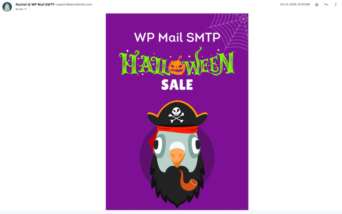
However, balance is key—don’t overload your email with too many visuals. There’s a reason why your recipient opened your email and has chosen to consume information this way.
So, don’t give them an art gallery when they’re expecting text on a screen.
Sign Off with a Signature
Personalization with your email design doesn’t have to be limited to your recipients only. Be sure to sign off with an original signature by you, too!
A professional email signature not only provides your contact information but also reinforces your brand. And when it’s part of your email settings or platform of choice, your signature is used with every email that comes from you.
Here are a few things you might want to include in your email signature:
- Photo of you
- Your name
- Job title or position
- Company name
- Small logo
- Social media links
An email signature is a great way for your audience to make a positive association with you, get to know you, and ultimately remain loyal to you or your brand.
Give Them an Out
These tips are good and great and all, but sometimes it just doesn’t work out.
So, you need to always include a clear and easy-to-find unsubscribe link in your emails. Not only is this required by law, but it also helps maintain a positive relationship with your audience by respecting their preferences.
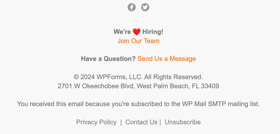
At WP Mail SMTP, we include the unsubscribe option at the bottom of every newsletter we send. Consider placing your unsubscribe link with the links I mentioned in your sign off, too.
Your readers know where to find you! And with other means of contact and connection, you just might get them back as email subscribers later.
Run Some Tests
Finally, when it’s all said and done, you should put your email design through some testing before going full send.
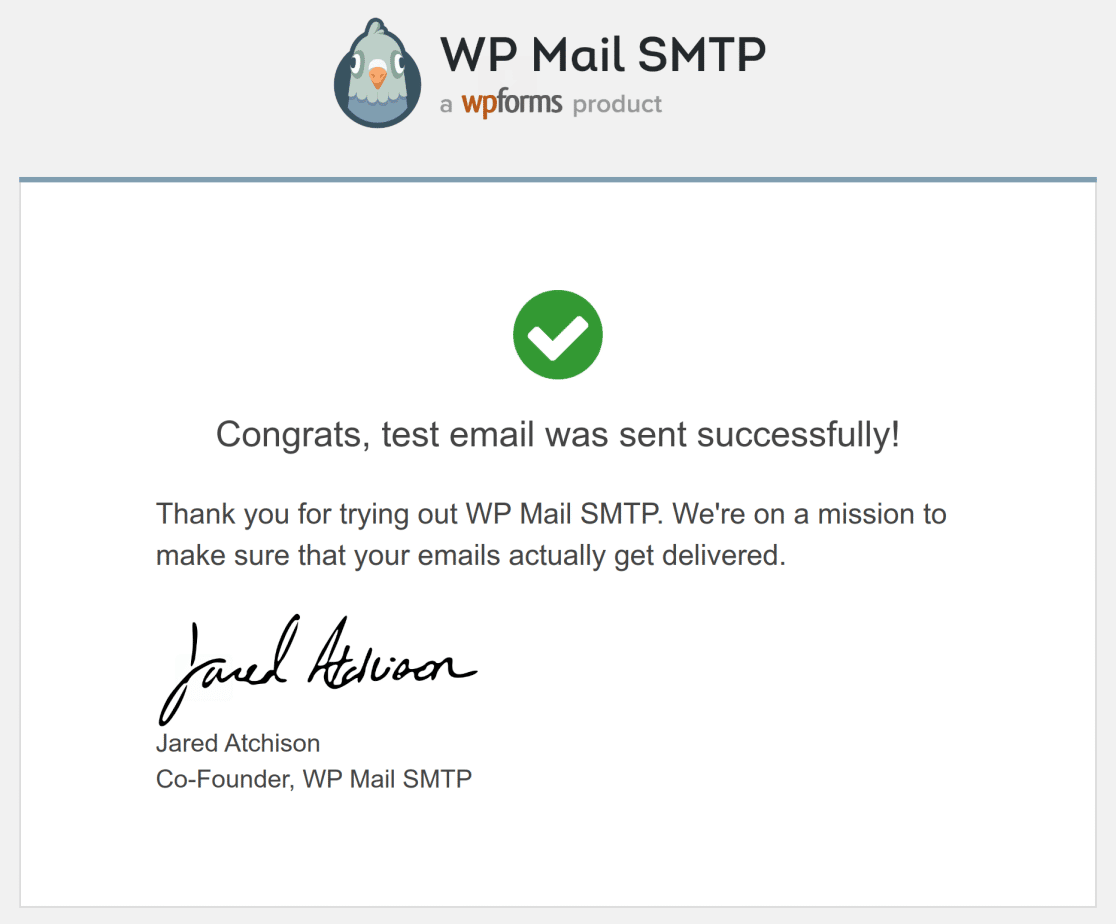
You should quite literally send a test email to yourself first to see what your recipient’s experience will be like. Your mailer platform should allow for this as a basic step when building an email campaign.
Then, to find out what resonates best with your audience, run A/B tests on different elements of your email, such as the subject lines, CTAs, or design layouts. You can then use these insights to continually improve your email campaigns.
Mistakes to Avoid
Now, let’s consider what NOT to do with your email design:
- Overloading with Information: Don’t stuff too much content into one email.
- Ignoring Visual Hierarchy: This creates the risk of not guiding readers through the email with a clear flow.
- Neglecting Alt Text for Images: Don’t forget to add alt text to images for accessibility and email clients that block images.
- Not Testing on Multiple Devices: You need to preview and test emails on various devices and platforms, even in dark mode.
There you have it! By following these best practices and avoiding some common mistakes, you’ll be your own email marketing pro in no time.
Have questions about any of these tips? Let us know in the comments.
FAQ
As the best email deliverability plugin for WordPress, we get a lot of questions about all things email. Here are some of the most frequently asked questions about email design:
What are the key elements of effective email design?
Effective email design includes a clear and compelling subject line, a well-organized layout, a strong call to action (CTA), mobile responsiveness, and visually appealing content that aligns with your brand.
How can I be sure my email design is mobile-friendly?
To create a mobile-friendly email design, use a responsive design that adjusts to different screen sizes, keep text concise, use larger fonts for readability, and ensure buttons are easily clickable on small screens.
How do I maintain brand consistency in my email designs?
Maintain brand consistency by using your brand’s color palette, fonts, and logo in every email. Also, keep a consistent tone and style in your messaging to reinforce your brand identity.
Next, Ensure Your Emails are Compliant
I mentioned in this article that including an unsubscribe option in your email is required by law. Did you know there are additional rules to follow when sending email? Take a look at our guide to CAN-SPAM, GDPR, and other elements of email compliance to learn more.
Ready to fix your emails? Get started today with the best WordPress SMTP plugin. If you don’t have the time to fix your emails, you can get full White Glove Setup assistance as an extra purchase, and there’s a 14-day money-back guarantee for all paid plans.
