AI Summary
It’s frustrating when potential customers come close to purchasing only to leave their items behind at checkout.
You might wonder if sending an email can really convince them to return to your website and complete their order.
The reality is that well-crafted abandoned cart emails have a proven track record of bringing customers back!
In this guide, I’ll share some of the best examples of abandoned cart emails, breaking down why they work and how you can apply their strategies.
15+ Best Abandoned Cart Email Examples
The concept is simple: someone adds items to their online shopping cart but doesn’t complete the purchase. Check out these best abandoned cart email examples to see how to drive these customers back to your site.
In This Article
Are your WordPress emails going to spam? You can use WP Mail SMTP to fix this problem. WP Mail SMTP re-routes your emails through a real email server to apply the right authentication.
1. Kizik
Subject line: Step in. Get out there.

This email from Kizik uses a clean design that resonates with the brand’s identity. It focuses on bringing customers back to complete their purchase.
The message is clear and focused on keeping up the momentum, reminding the customer how close they are to owning the shoes.
What I like in this abandoned cart email example:
- The headline “Keep that momentum going” is simple and to the point, encouraging customers to complete their purchase without feeling pushy.
- The shoe image reminds the customer exactly what they left behind, making it personal and reinforcing the emotional connection.
- The bold “See My Cart” and “Checkout Now” buttons are well-placed, giving users a clear next step without overwhelming them with choices.
- The message “No Hands Here” emphasizes the unique value of the shoes (easy to slip on), subtly reminding the customer of the product’s unique selling point.
Key takeaway:
The strategically placed CTAs and product imagery make it easy for the customer to pick up where they left off and complete their purchase.
2. prAna
Subject line: The Heavana™ Racerback Tank and more…
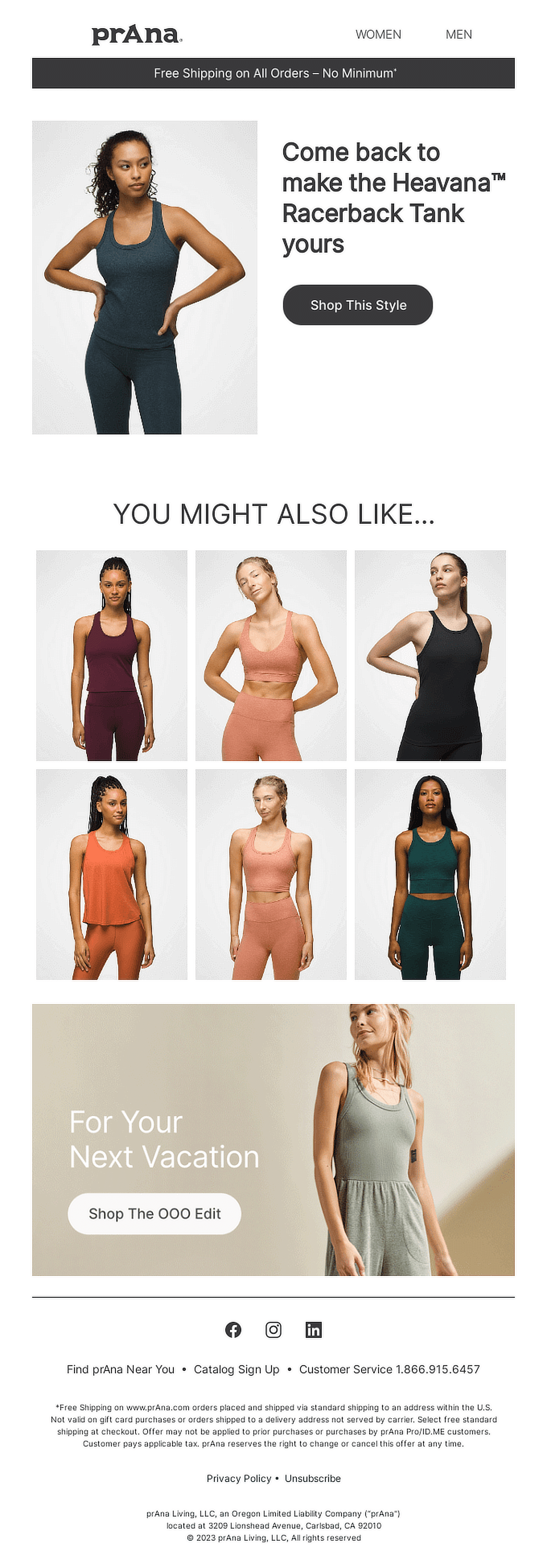
This prAna abandoned cart email is visually clean and encourages recipients to complete their purchase by reminding them of the exact product they left behind.
The featured product—the Heavana™ Racerback Tank—is front and center, with an inviting “Shop This Style” CTA (call-to-action), giving a subtle nudge to pull the recipient back into the shopping process.
What I like in this abandoned cart email example:
- The email highlights the Heavana™ Racerback Tank, which is likely the item the customer was interested in. The use of a large product image helps remind customers of what they almost bought.
- The “You Might Also Like” section offers similar items, increasing the chance of upselling or cross-selling if the shopper is on the fence about their original selection.
- The banner at the top offering “Free Shipping on All Orders – No Minimum” adds extra motivation for customers to complete their purchase, potentially reducing hesitation.
Key takeaway:
The product reminders and related item suggestions make it easy for customers to reconsider their cart, giving them multiple reasons to finish their shopping.
3. Liquid Death
Subject line: Maybe you died?

This Liquid Death abandoned cart email brings a refreshing (and darkly humorous) twist to standard retargeting. It instantly grabs attention with a playful, self-aware tone that perfectly fits the brand’s edgy identity.
The subject line pulls readers in with humor, making it hard to ignore. The body of the email is casual, conversational, and even a bit cheeky, which feels personal and adds a human touch to the brand’s communication.
What I like in this abandoned cart email example:
- The email immediately stands out with its humor and casual approach. It feels like it’s written by a real person, breaking away from the typical robotic emails.
- The “More Stuff You Don’t Need” section humorously displays other products, using reverse psychology to tempt the customer into exploring more.
- The “FINISH CHECKING OUT” button is clear and bold, positioned front and center to encourage conversion without too many distractions.
Key takeaway:
Humor and personality can be incredibly effective in abandoned cart emails, especially when done in a way that aligns with your brand.
4. Hulu
Subject line: TV Fan, Your Free Trial is Waiting
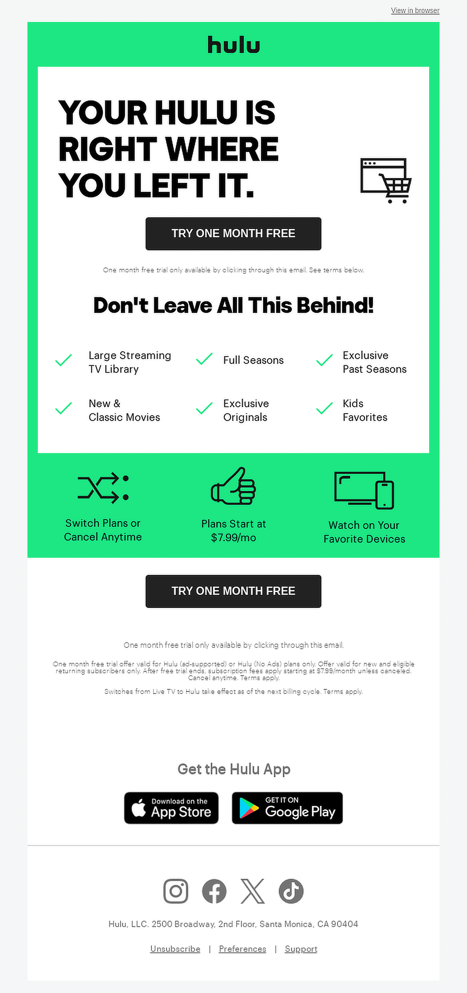
This Hulu abandoned cart email does a great job of reminding customers of the value they’re missing out on without being too pushy.
The email is structured to make it easy for the reader to understand what’s being offered and how to take action, with no unnecessary distractions.
What I like in this abandoned cart email example:
- The subject line and CTA both reinforce the free trial offer, encouraging customers to return with minimal effort.
- Hulu reminds users of its extensive content library, showcasing the various categories they would miss out on, like “Full Seasons,” “New & Classic Movies,” and “Kids Favorites.”
- By emphasizing how easy it is to switch or cancel plans and the ability to watch on any device, Hulu eliminates any doubts potential customers might have.
Key takeaway:
The combination of a free trial offer and convenience-focused benefits makes it more likely that users will take the next step and sign up.
5. Sonos
Subject line: Circling back

In this Sonos abandoned cart email, the focus is on a clean, minimalist design that encourages the customer back to their cart.
The email opens with a friendly, conversational tone, asking the customer if they “like what they see,” followed by a strong visual of the Sonos Move 2 speaker.
What I like in this abandoned cart email example:
- The customer is given several options to return to their cart, pay later, or buy now, with a consistent black-and-white color scheme across the buttons that maintains the brand’s aesthetic.
- The “try it for 45 days” guarantee reassures customers that they can return the product if they’re not satisfied, reducing the hesitancy around making a purchase.
- The email reflects Sonos’s premium, eco-conscious brand identity, even including a message about sustainability at the bottom of the email.
Key takeaway:
The clean and minimal design, paired with actionable CTAs, reflects the brand’s premium positioning and provides a seamless path for customers to return and complete their purchases.
6. Rael
Subject line: We noticed you, noticing us. 😉

Rael’s abandoned cart email takes a friendly, conversational approach to re-engage customers who didn’t complete their purchase.
The email’s use of a playful subject line with an emoji immediately draws attention and adds personality to the message.
What I like in this abandoned cart email example:
- The featured product is displayed with a clean, appealing image, making it easy for the customer to visualize what they are considering.
- The mention of free shipping on orders over $50+ creates a sense of savings, giving customers an extra reason to finish their purchase.
- The clear “Take Another Look” button prompts immediate action, while the secondary “Shop Now” CTA showcases more products, increasing chances of conversion.
Key takeaway:
The combination of visually appealing product images, relevant recommendations, and an incentive (free shipping) helps to drive the customer back to the checkout page.
7. Surreal
Subject line: Thinking about Surreal?

Surreal’s abandoned cart email grabs attention with a lighthearted, quirky tone that matches its fun branding.
Right from the quirky headline, “Grab breakfast by the bowls,” the email speaks directly to the customer, encouraging them to rethink their breakfast choice.
The message humorously suggests alternatives like oats or even spaghetti but quickly brings it back to why Surreal is a better choice: high protein, zero sugar, and low carbs.
What I like in this abandoned cart email example:
- A bright, bold “Feed Me” button serves as the call-to-action (CTA), inviting the customer to return and complete their purchase.
- A clear, concise chart comparing Surreal to other cereals shows the key advantages and reinforces the health benefits of their product.
- The quirky language, such as suggesting spaghetti for breakfast, keeps the tone playful and memorable.
Key takeaway:
The playful and humorous tone, combined with a strong focus on the product’s nutritional value, creates an abandoned cart email that stands out.
8. Paro
Subject line: Forget something?
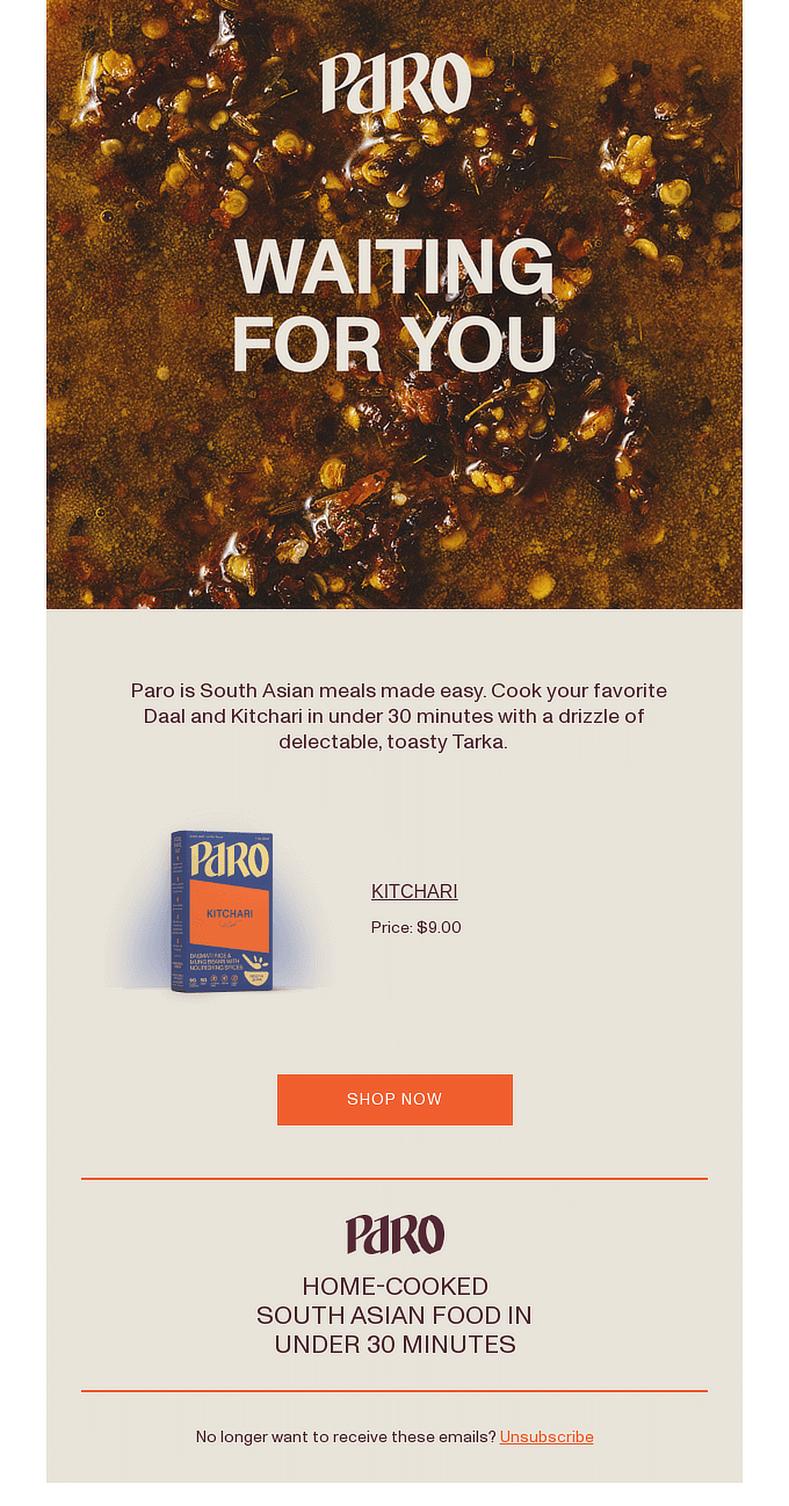
Paro’s abandoned cart email stands out with its warm, cozy vibe, focusing on familiar South Asian meals.
The email showcases their Kitchari product with an inviting call-to-action, “Waiting for you,” reminding the customer to complete their purchase.
What I like in this abandoned cart email example:
- Paro effectively highlights authentic South Asian cooking methods, making the email relatable to its target audience.
- The text, “Waiting For You,” adds a personal touch that makes the user feel like the product is meant for them.
Key takeaway:
The clear messaging, cultural references, and a strong, singular CTA help remind customers why they considered the product in the first place.
9. Javy
Subject line: You left something behind 🛒
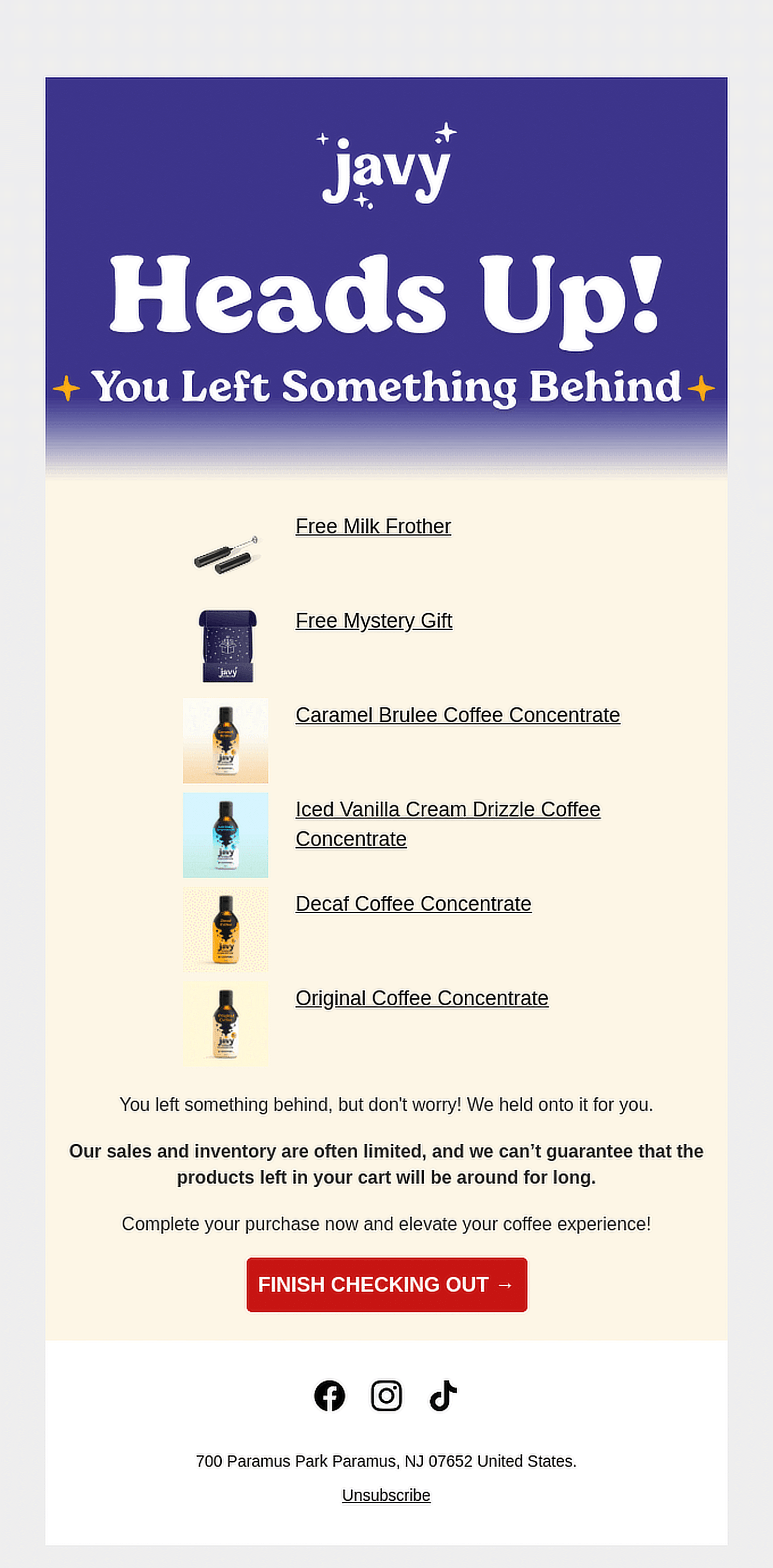
Javy’s abandoned cart email is a great example of how to keep a potential customer engaged by reminding them of the products they left in their cart.
The subject line “You left something behind” grabs attention right away and adds a bit of urgency.
What I like in this abandoned cart email example:
- The clear display of the products left in the cart ensures the recipient remembers exactly what they were looking at.
- Mentioning that sales and inventory are limited motivates customers to act quickly, leveraging the fear of missing out.
- The bright red “Finish Checking Out” button stands out, making the call to action easy to follow and impossible to miss.
Key takeaway:
Simple, straightforward, and focused on the customer’s next steps, this email shows how a little motivation can go a long way in boosting conversions.
10. Grove Collaborative
Subject line: Where’d you go?

Grove Collaborative’s abandoned cart email is a perfect reminder for customers to finish their purchase. The subject line is friendly and curious, asking where the customer went, which adds a personal touch.
What I like in this abandoned cart email example:
- Offering a free cleaning starter set adds value and motivates recipients to complete their purchase.
- Grove emphasizes their eco-friendly mission by mentioning their plastic-neutral and strict ingredient standards, which resonates with environmentally aware customers.
- The bottom of the email offers easy access to explore different categories, such as cleaning essentials, laundry, and personal care, helping the customer engage with the brand further.
Key takeaway:
The combination of free gifts and a clear CTA makes it highly effective in encouraging conversions while promoting a strong brand identity.
11. Huckberry
Subject line: Your cart’s aging like a fine bourbon

Huckberry’s abandoned cart email carries a confident and motivating tone that presses the recipient to complete their purchase.
What I like in this abandoned cart email example:
- “LET’S DO THIS” grabs attention right away and sets a motivational tone to help the buyer continue with the purchase.
- The inclusion of the recipient’s name, “Hey Smiles Davis,” creates a more personalized shopping experience.
- The “More Good Stuff” section offers a range of suggested products that might pique the shopper’s interest and potentially increase the cart’s value.
Key takeaway:
The focus on product scarcity subtly pushes customers to act quickly, while the clean design and clear product recommendations add extra incentive to finish the purchase.
12. Loftie
Subject line: Still not sure?

This Loftie abandoned cart email takes a soft-sell approach, using emotional triggers like “You deserve better sleep” to remind the customer why they were interested in the product.
What I like in this abandoned cart email example:
- Offering 10% off with a clear code (SLEEP10…) inspires immediate action without sounding overly promotional.
- Features like a 60-night money-back guarantee, free shipping, and a 1-year warranty provide reassurance, reducing any hesitation to complete the purchase.
- The warm, relaxing imagery helps connect the product to the idea of calm and relaxation, making the shopper feel more confident about their purchase.
Key takeaway:
This combination of emotional and practical triggers makes for a compelling abandoned cart email.
13. Whoop
Subject line: No More Excuses—Step Up Your Training
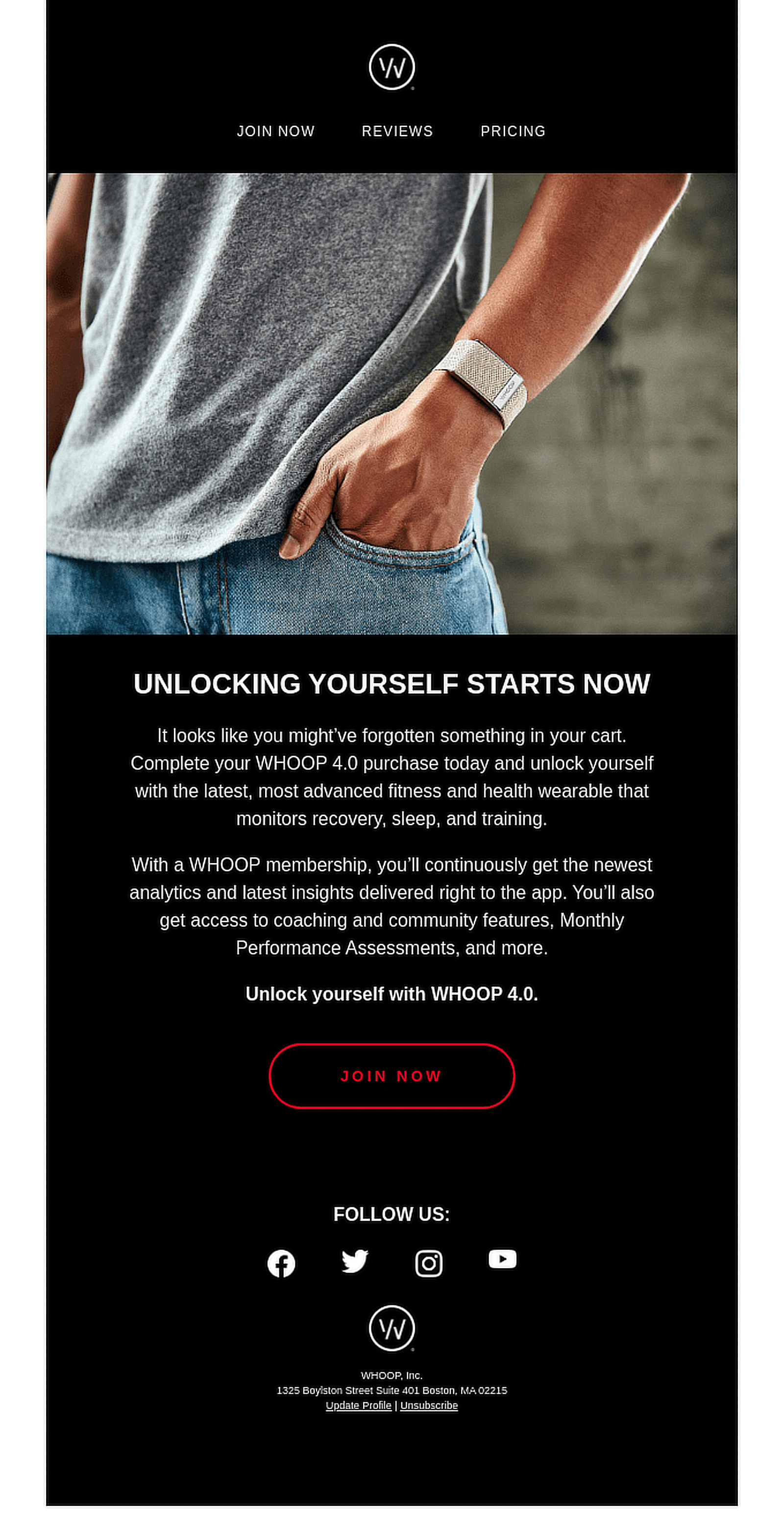
This email from Whoop takes a bold and direct approach, with the main goal of pushing customers to complete their purchase of the fitness tracker.
What I like in this abandoned cart email example:
- The bold CTA “JOIN NOW” stands out against the darker background, creating a sense of urgency and importance.
- The copy emphasizes the added value that comes with the Whoop membership, such as advanced insights, coaching, and community access.
- The minimal use of text and imagery helps focus the reader’s attention on the main selling points, making it easy to skim and absorb key information.
Key takeaway:
The simple, direct design paired with a clear CTA helps maintain focus on the product, while the added value of membership sweetens the deal.
14. Haoma
Subject line: Any questions?

The brand reassures customers that their interest is noted and offers help to answer any lingering questions, adding a personal touch with a simple email reply option.
What I like in this abandoned cart email example:
- The imagery and color scheme reflect Haoma’s natural and simple aesthetic, creating a seamless experience that aligns with the product offerings.
- Highlighting customer favorites urges further browsing and increases the chances of shoppers discovering additional items of interest.
Key takeaway:
The simple design and message create a sense of ease, which aligns with the overall calming and natural brand identity.
15. Better Brand
Subject line: You deserve something Better

This abandoned cart email from Better Brand uses engaging, friendly language to entice shoppers to complete their purchase.
The email leans into the concept of a shared journey towards a “better” lifestyle, while gently prompting the reader to take action on their incomplete cart.
What I like in this abandoned cart email example:
- The copy is conversational and ties the customer into a broader community of people who want to make healthier choices, enhancing the sense of connection.
- The email effectively lists key benefits of the product (such as 90% less carbs, 250% more protein) in a clear and concise way, making it easy for the reader to see the value at a glance.
- The call-to-action “Complete Your Purchase” fits perfectly with the casual tone of the email, making it feel less like a sales pitch and more like a helpful reminder.
Key takeaway:
The email balances friendly, community-driven messaging with strong product benefits to enable shoppers to finalize their purchases.
FAQs — Abandoned Cart Email Examples
Recapturing leads with abandoned cart emails is a popular topic of interest among our readers. Here are answers to some common queries about it:
What is an abandoned cart email?
An abandoned cart email is a follow-up message sent to customers who added items to their online shopping cart but didn’t complete the purchase.
It’s a gentle reminder encouraging them to return to the site and finish the transaction, often offering incentives like discounts or free shipping.
How to create an effective abandoned cart email sequence?
To create an effective abandoned cart email sequence, start with a reminder email shortly after the cart is abandoned.
Follow up with a second email offering incentives like a discount, and finally, send a last-chance email to create urgency.
Can I use an abandoned cart email template?
Yes, you can use an abandoned cart email template to save time and ensure consistency.
Many tools like Constant Contact and Drip offer customizable templates that allow you to add your branding and messaging while keeping the focus on bringing customers back to complete their purchases.
What should I write in an abandoned cart email?
In an abandoned cart email, start by reminding the customer of the items they left behind, then create urgency or offer an incentive, like a discount or free shipping, to encourage them to complete the purchase.
Keep the message clear and friendly, and include a prominent call-to-action button to bring them back to their cart easily.
Next, Email Design Examples and Best Practices
If you send emails, you need to consider your email design—simple as that. Even the most compelling message can be overlooked if it isn’t presented well. Check out this guide for the best email design examples and practices.
Ready to fix your emails? Get started today with the best WordPress SMTP plugin. If you don’t have the time to fix your emails, you can get full White Glove Setup assistance as an extra purchase, and there’s a 14-day money-back guarantee for all paid plans.
If this article helped you out, please follow us on Facebook and Twitter for more WordPress tips and tutorials.

